Redesigning Capichi’s app
Reading time: 5min.
Introduction
Capichi is a tech startup company based in Southeast Asia. Their main product is Capichi Delivery, a food delivery app that allows users to order food, drinks and groceries through their smartphone and have it delivered to the location of their choice.
Goals of the project
The objective of this project was to redesign the app's UI/UX, beginning with the homepage and the search function. This decision was influenced by feedback from the marketing team and the product owner. The project was divided into several stages, starting with a research phase followed by an analysis phase. The design phase was split into two parts. Due to time constraints faced by other stakeholders, the testing was scheduled to take place after the release of the latest version of the product.
Date
2023
My role
I have worked on this project as full-time product designer for the company. I got to work alongside the Product Owner, the CMO and the Head of Development. I planned the steps and organised the development of the project within the deadline given.
Location
I have worked remotely on this project, the company being based in Vietnam and myself being in France. The interviews and meetings were all held online with people in Vietnam. English language was mainly used.

1 - Research
For this project, I conducted usability tests to validate stakeholder assumptions and identify any issues in the app experience. As these tests were a first for us, we initiated them with user interviews to better understand our users’ goals, contexts, and behaviors.
We developed a screener to select appropriate users, and with help from a junior designer, scheduled the sessions and prepared the scripts and tasks for the usability tests.
During these sessions, we recorded interactions and took detailed notes, which were analyzed after each session.
2 - Analysis
Techniques used
To manage the qualitative data from the usability tests, I used an affinity diagram and a customer journey map. These methods helped organize the data and pinpoint areas needing improvement. Working with the junior designer on the affinity diagram fostered a productive idea exchange, enhancing the results.
Results
The analysis confirmed that the homepage and search function were the main friction points for users. We also identified additional pain points, which we shared with stakeholders. The decision was made to address these issues in a subsequent project.
3 - Designing
User flows
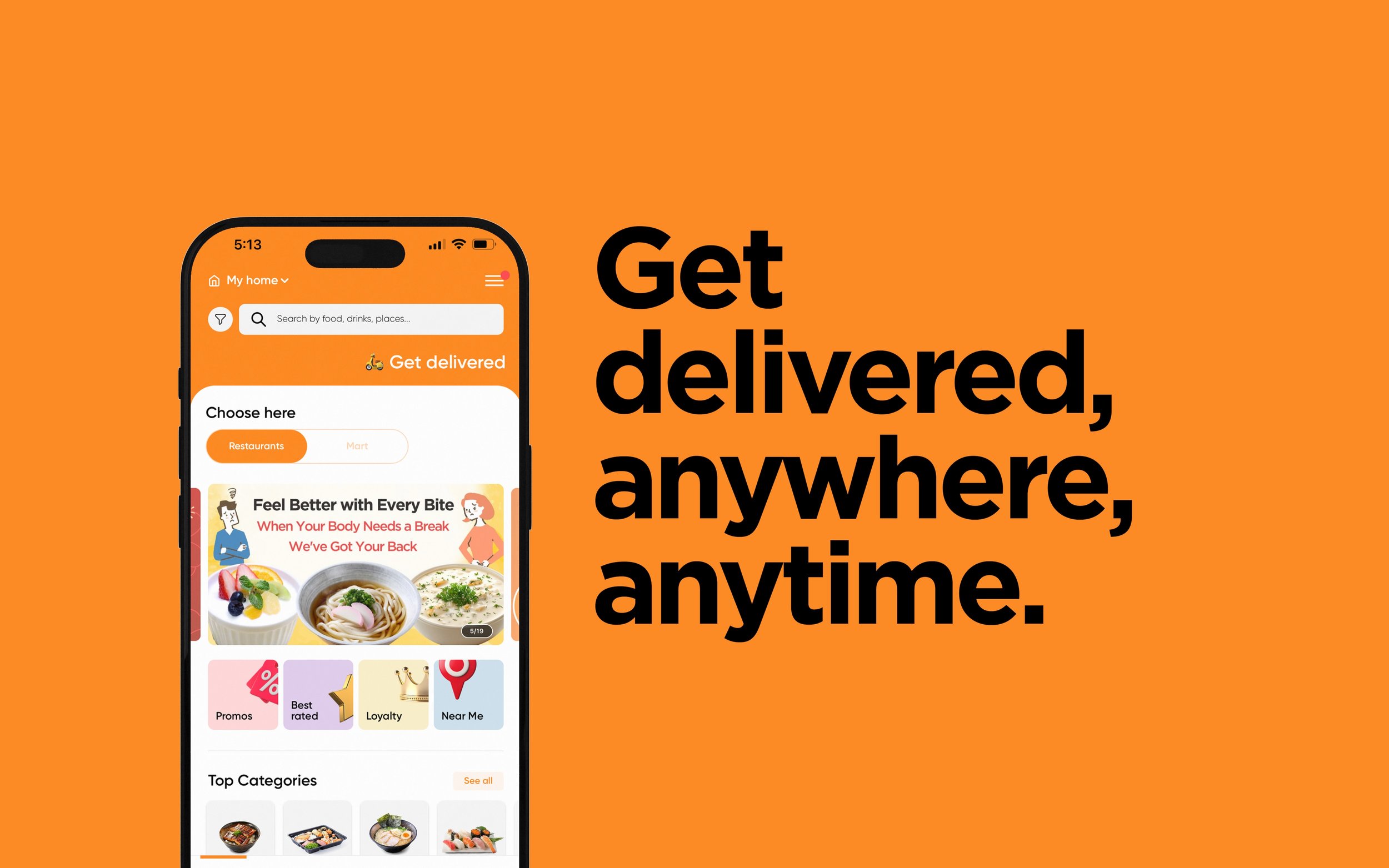
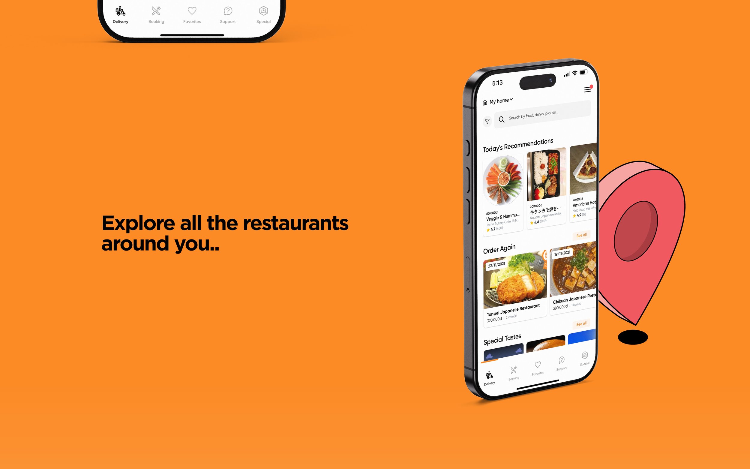
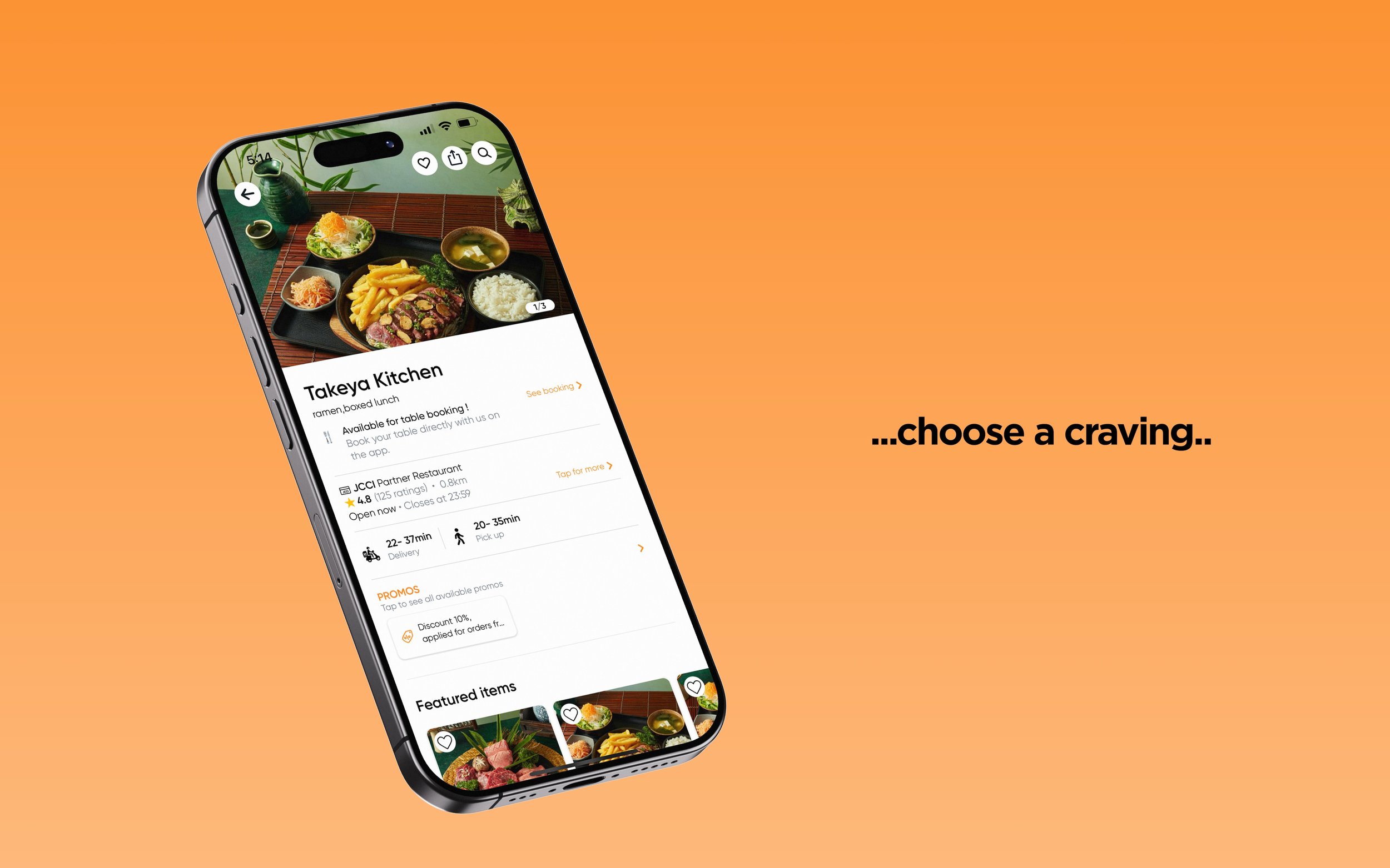
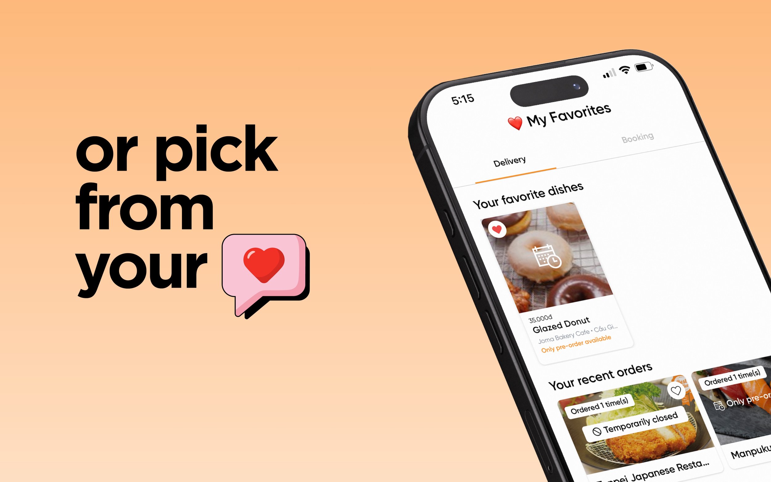
After identifying key issues, I created new user flows for the homepage and search function to improve the app's user experience. This included gaining stakeholder approval.
Sketching to wireframing
Due to time constraints at the startup, I used sketching to quickly generate ideas, which formed the basis for the wireframes. These wireframes incorporated alternate designs for the homepage, and after evaluation, two versions were merged to create a final wireframe that guided the ultimate design iteration.
Getting detailed
As this was a redesign, most of the design library, such as colors and typefaces, was pre-established. I refined the use of these elements by creating a tailored set of components and fonts for the redesign, ensuring visual consistency across the app.
Making the content
Working solo, I designed icons and images for various app sections, like food categories. I sourced illustrations from stock images and customized them to align with the app’s aesthetics and brand identity.
4 - Prototyping & Handover
Prototyping
To help validating and sharing the new design alongside all stakeholders, we’ve decided to make a high-fidelity prototype of the new pages. This was done in Figma. It was also a good way to share the ideas of the final look and feel with the development team.
Handing the design over
To ensure a smooth handover, I prepared detailed design annotations for each state and interaction to provide comprehensive information. With an internal development team, communication between design and development was frequent. After completing the initial design version, I delivered a second round of annotations to aid in finalizing the product.
To conclude
Since its release, the app has consistently attracted new users and has grown to become a reference for food delivery in Vietnam. The initial reactions were very positive, and we are now preparing to redesign the remaining pages and functions to further enhance the user experience.
Download the app here
What would I do differently
Given the opportunity, I would gather additional user feedback through surveys and further usability testing to enrich our data for more informed decisions. This comprehensive data could also help persuade stakeholders who missed the initial research phase.


