Hierarchy of Typography
Reading time: 2-3min.

Introduction
During my mentorship alongside Milka Broukhim (see who is Milka here) during Covid, I have produced over 230+ design layouts using the same amount of text with a set of rules to follow at each step of the mentorship. The course taught by Milka is “A rigorous introduction to the fundamentals of typography, with emphasis on the formal aspects of designing with typographic elements, and the responsibilities inherent in working with language.” During the course “emphasis is place on exercises to allow students to become confident in handling typography as text in page layout structure. Progressive typographic decision-making through such exercises provides students with the necessary grounding in principles of design, scale relationships, types of contrasts, use of space, asymmetry, hierarchy, legibility, composition, alignment, structure and more.'“
Date
2022
My role
I have worked on this project fully, from start to finish, all while being under the mentorship and critical eyes of Milka Broukhim.
Location
I have worked remotely on this project, me being in Vietnam and Milka being in California, USA. We communicate through emails and zoom video calls.
Goals of the project
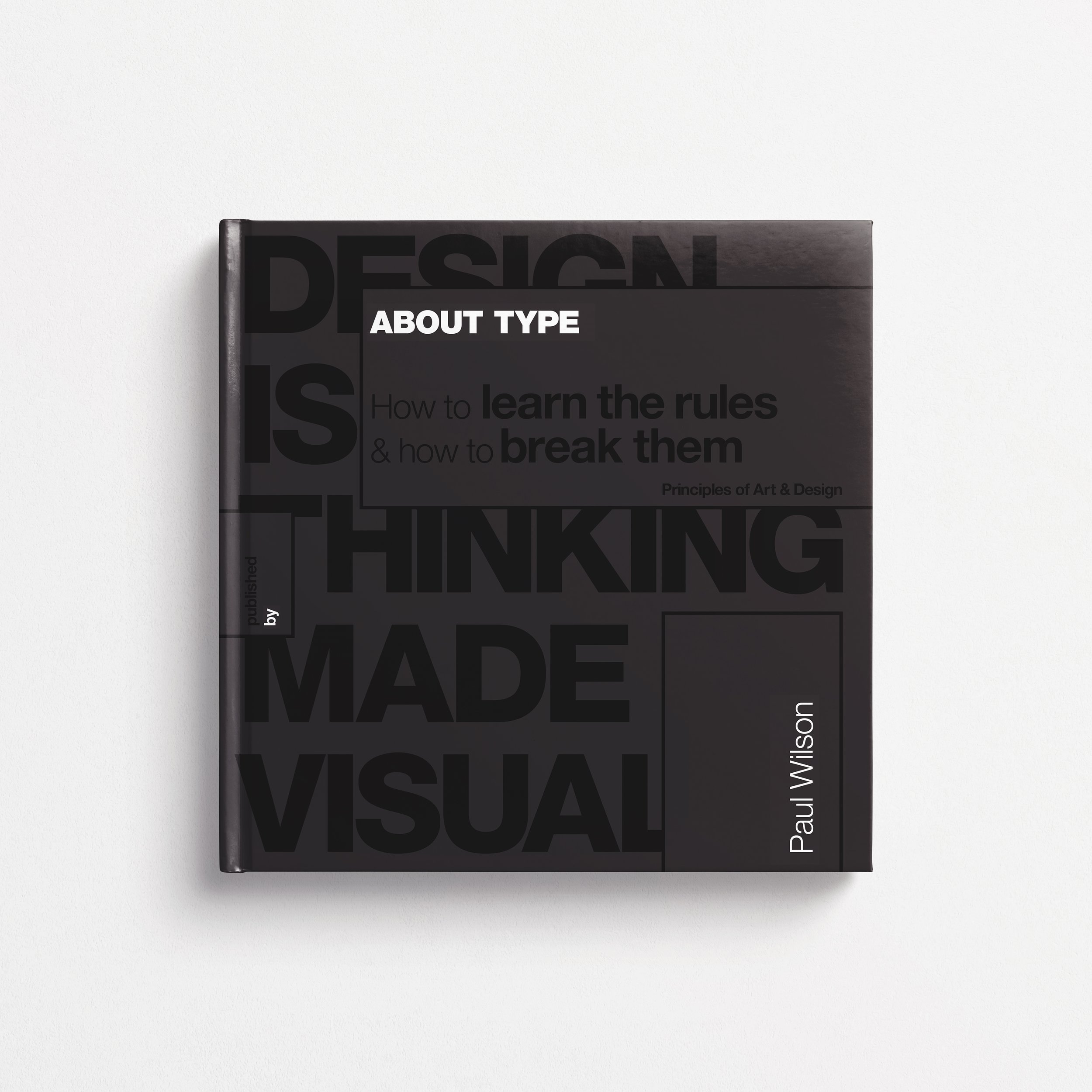
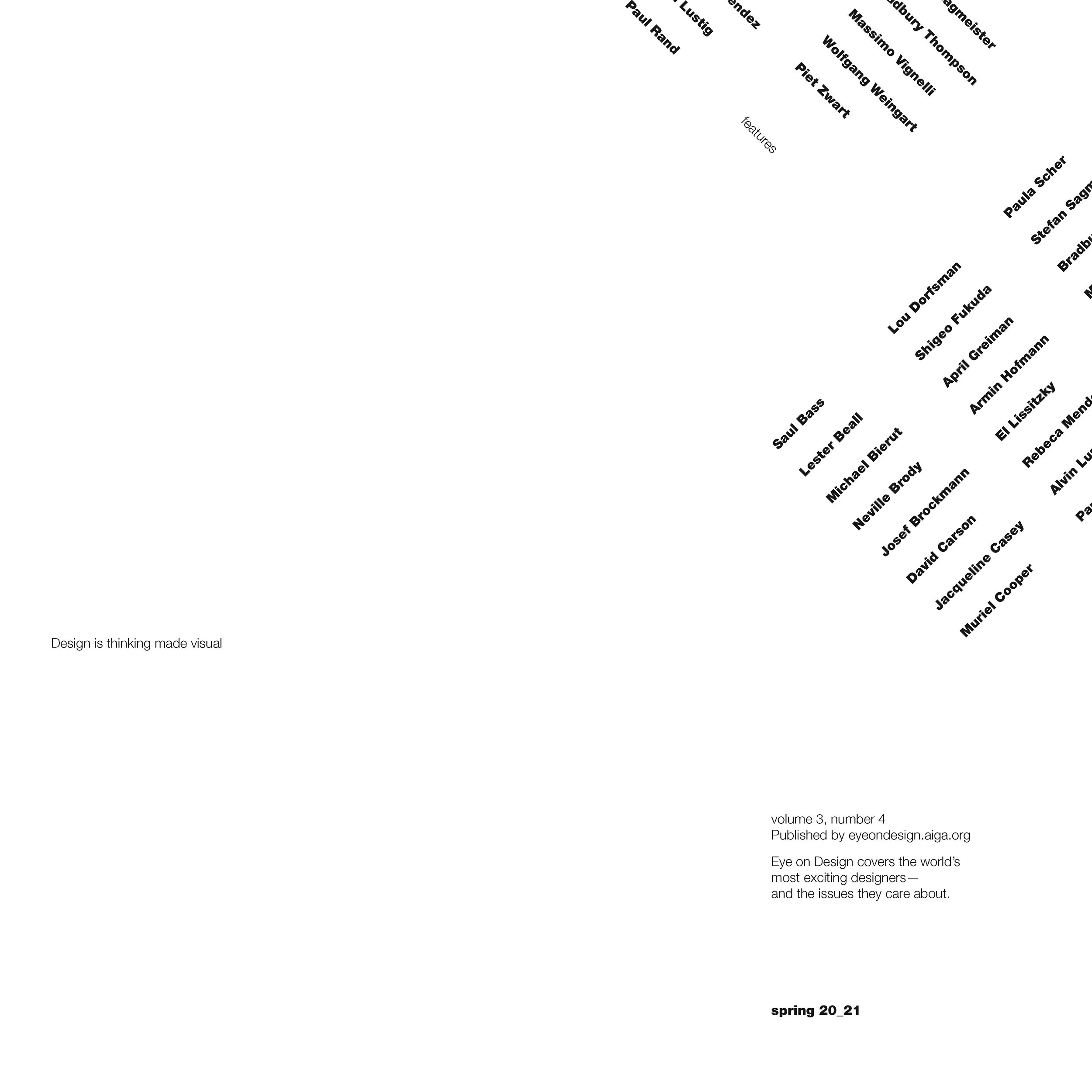
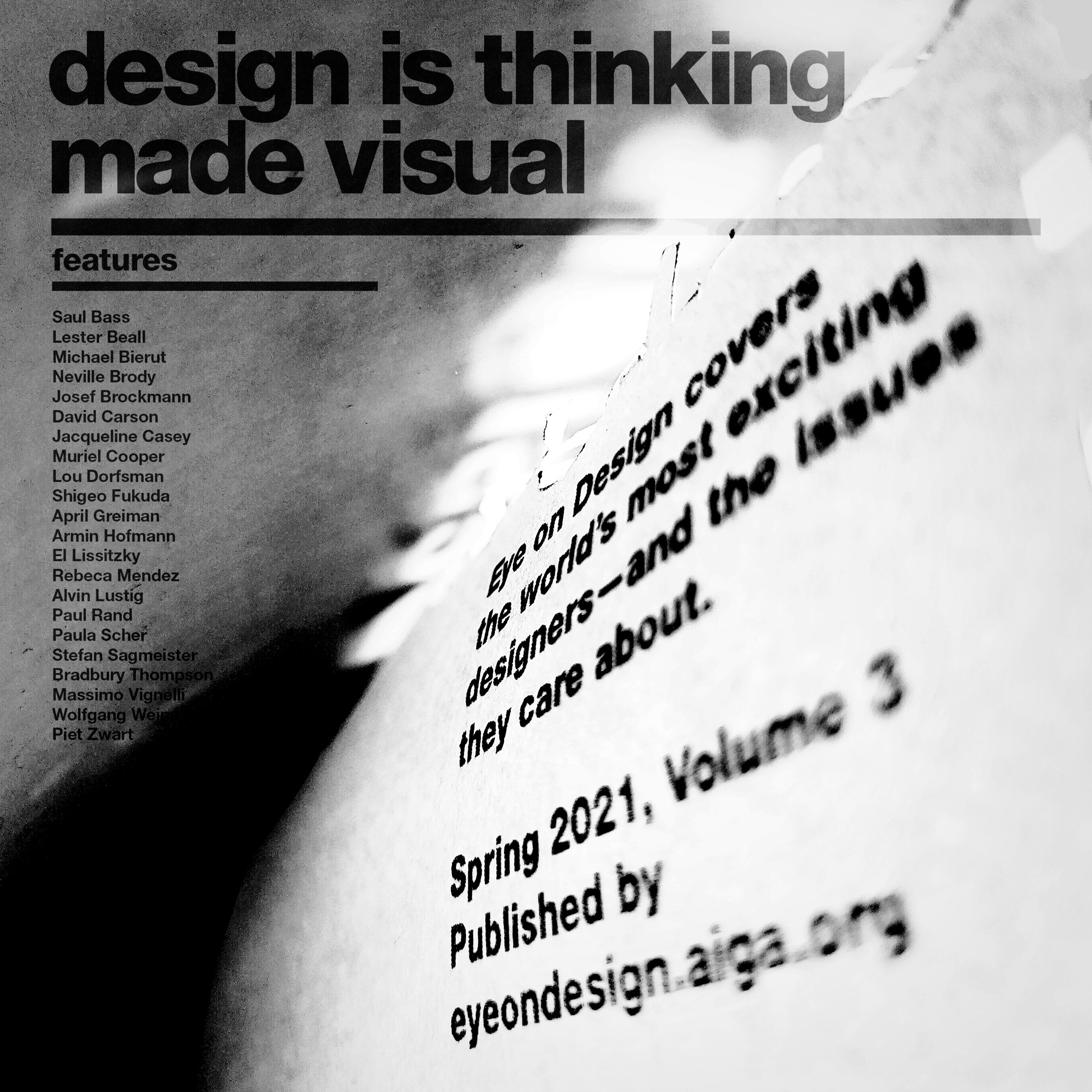
This project marked the culmination of my course, wherein I aimed to create a cohesive collection of the top 5 designs in each category. To accomplish this, I embarked on designing an entire book that incorporated effective typography, adhered to a well-structured grid system, and paid meticulous attention to typography grammar. Throughout the process, I emphasized the organization of information, chapter layouts, page layout, grid structure, typography elements, including typeface selection, point size, line length, leading, tracking, and kerning, all with the objective of establishing a consistent and hierarchical presentation.
In addition to the design aspect, I also provided a narrative and critical analysis for each chapter, ensuring that the content and analysis were presented in a clean and creative layout.
At the beginning..
The first weeks of exercise consisted of using different set of rules to constraint the design such as using only one size one weight, or two sizes one weight… it is a great way to learn how to use space and composition of the design to create an interesting layout that is attractive to the eye.


..getting to experience..
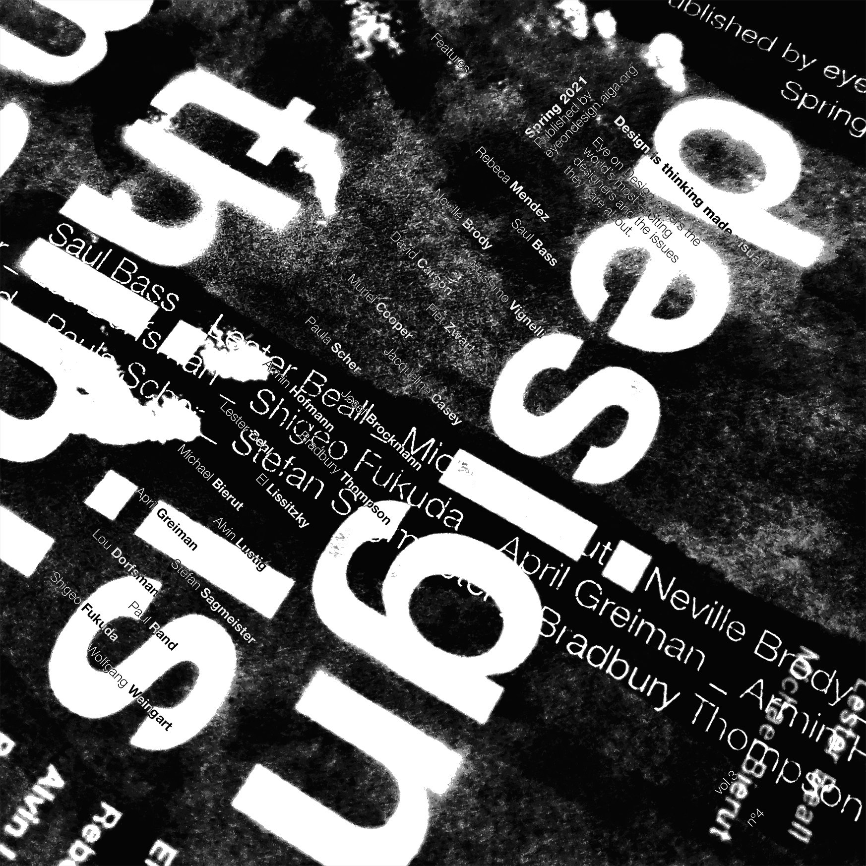
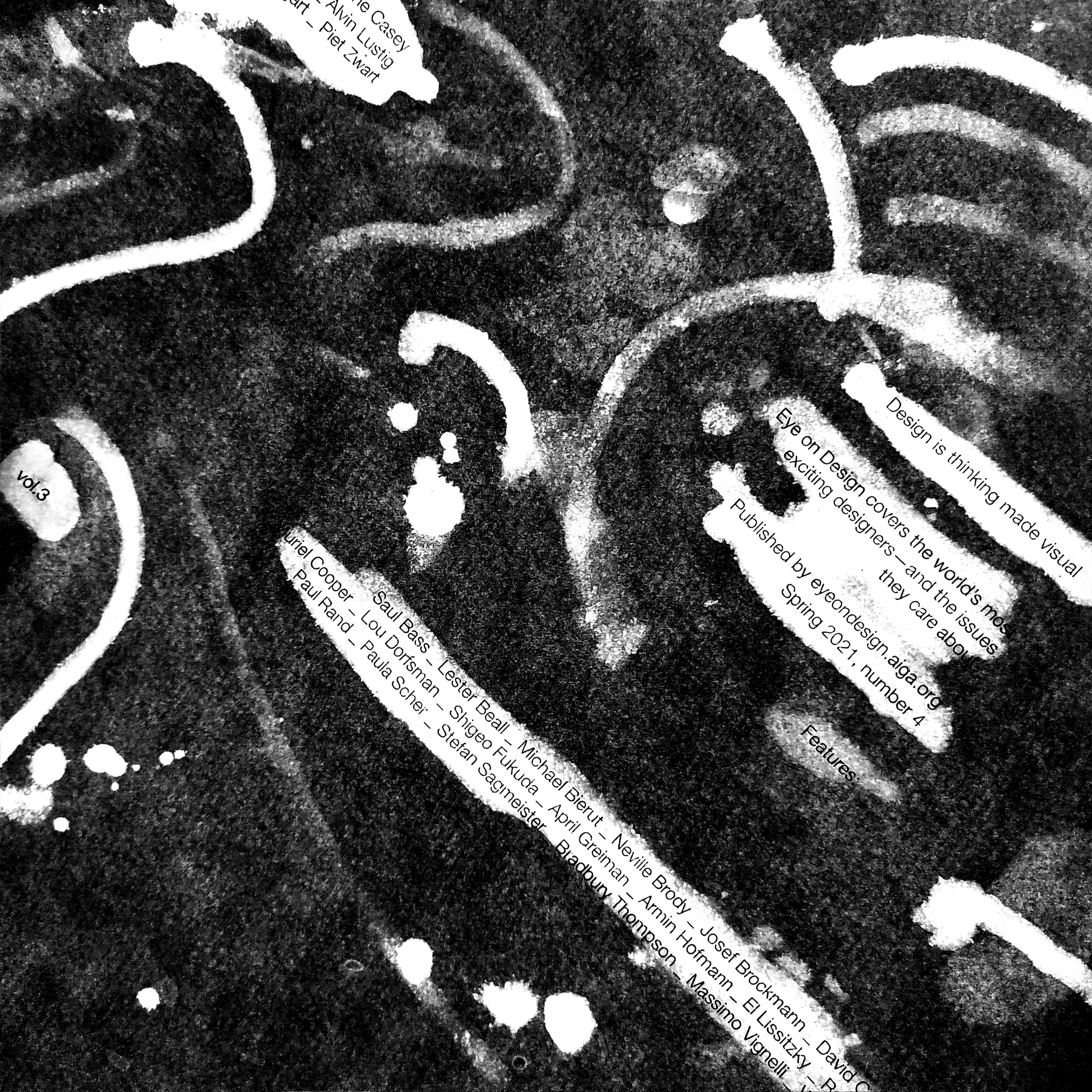
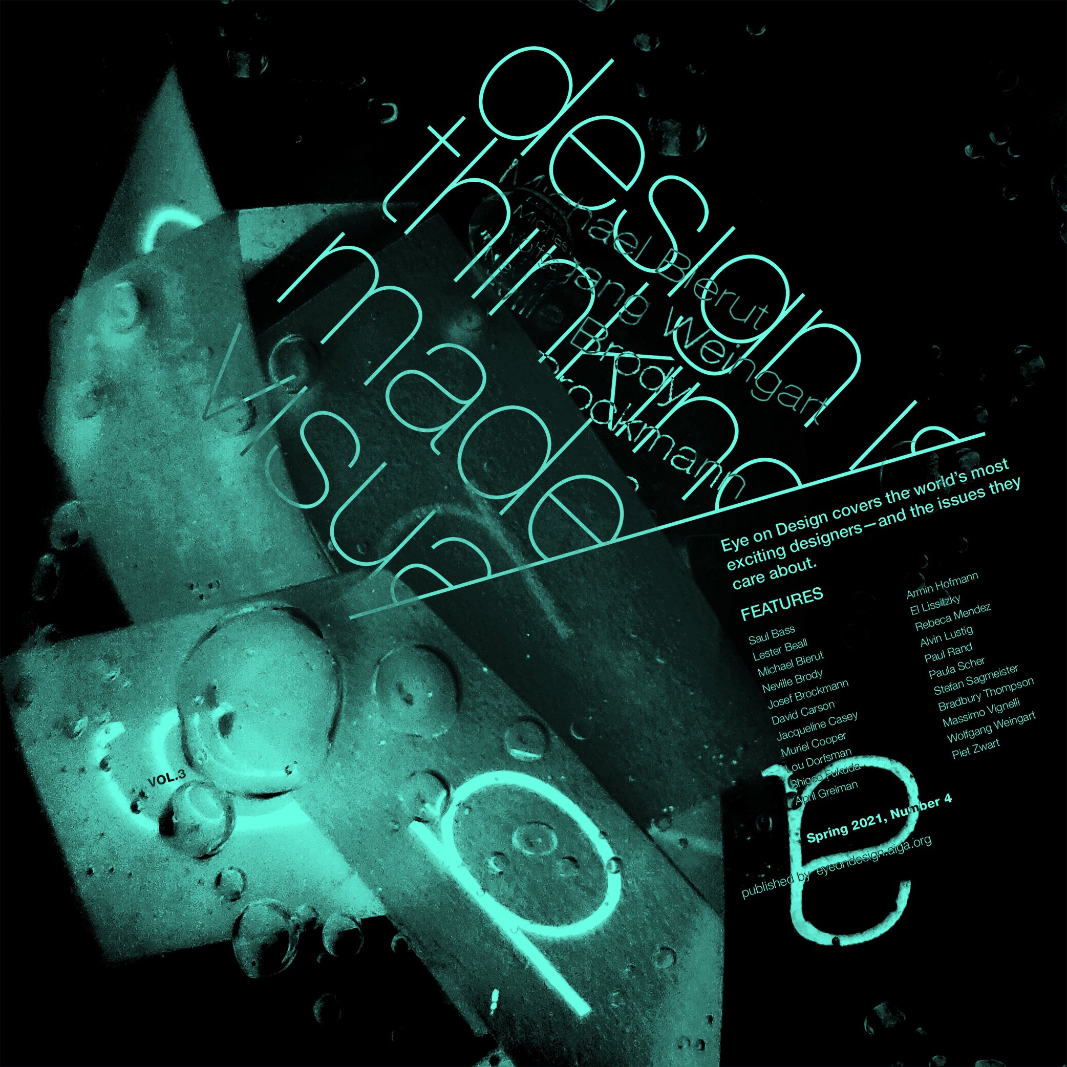
Experimental type have to do with designs done by hand and by using objects and techniques around us to give the design a certain texture, look, feel or overall shape. I had to leave my computer for most of the time and start to freeze, draw on, mix, or even burn my designs.


…and the finish line
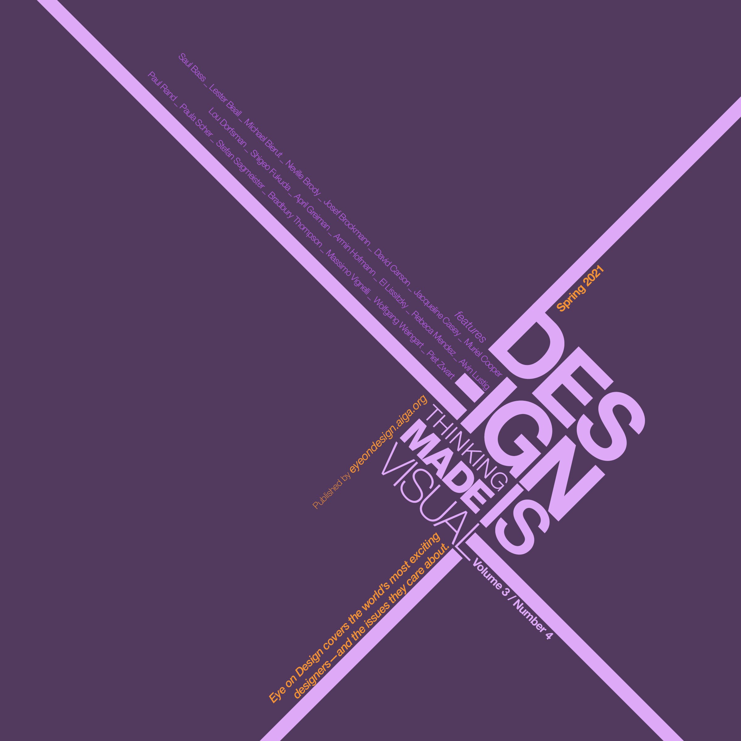
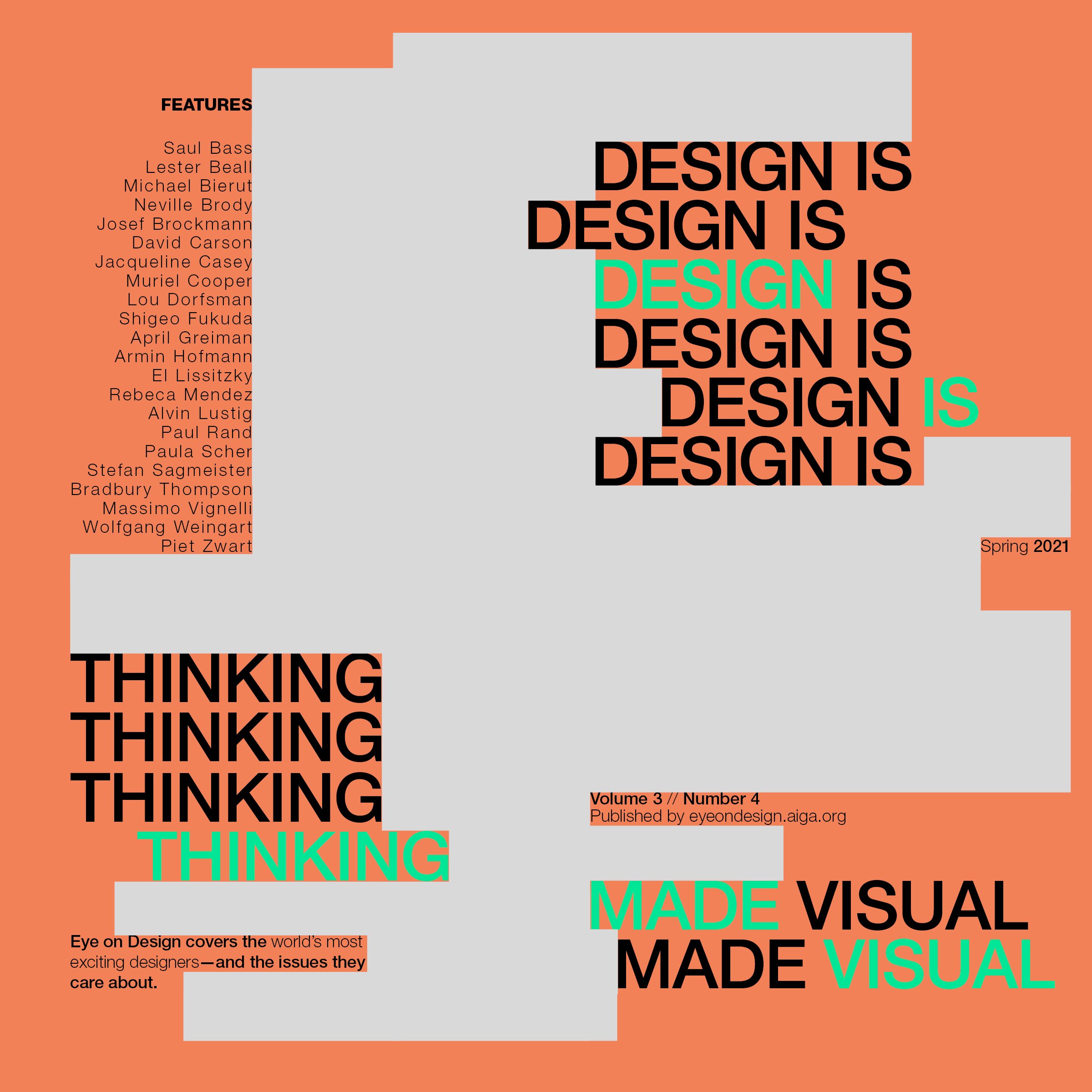
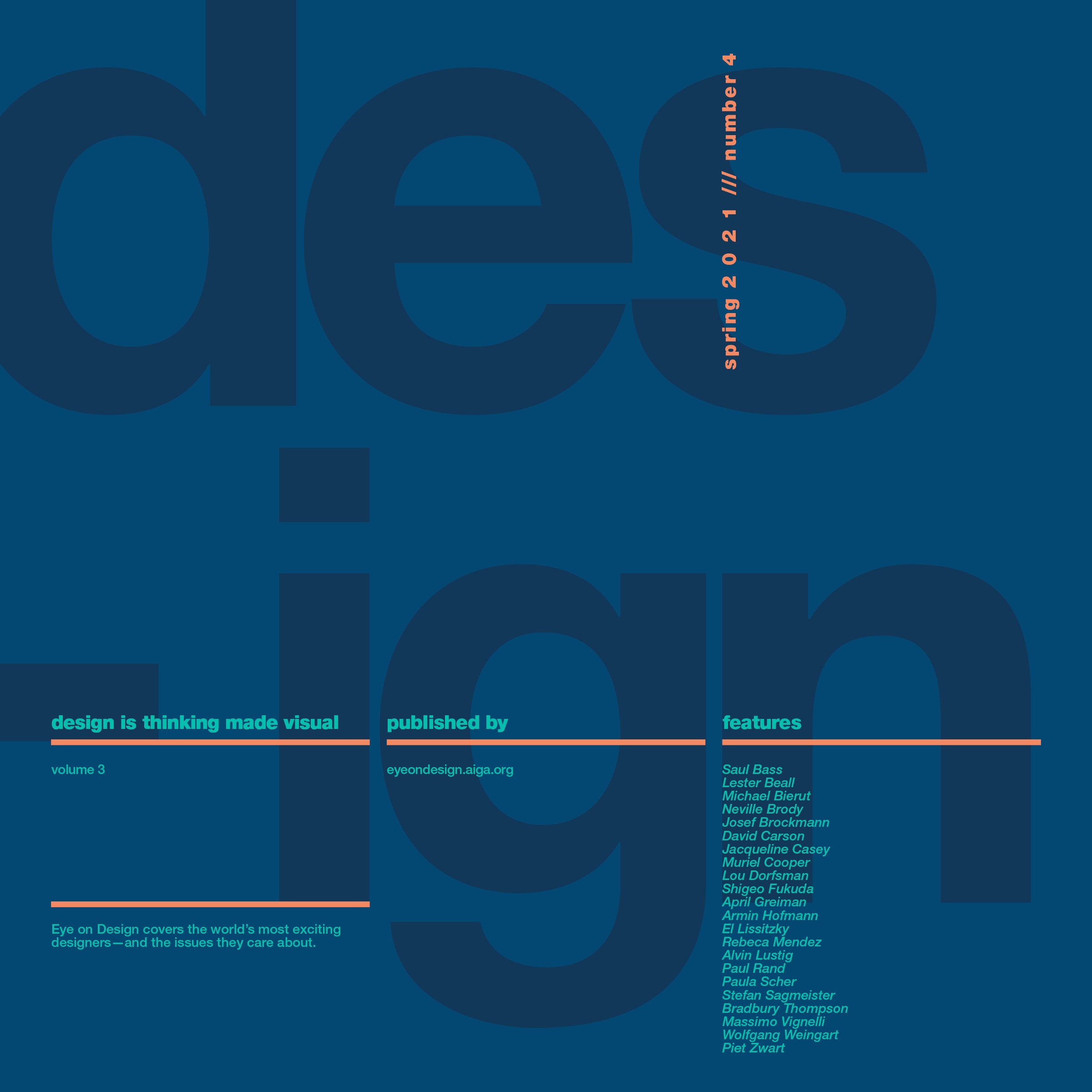
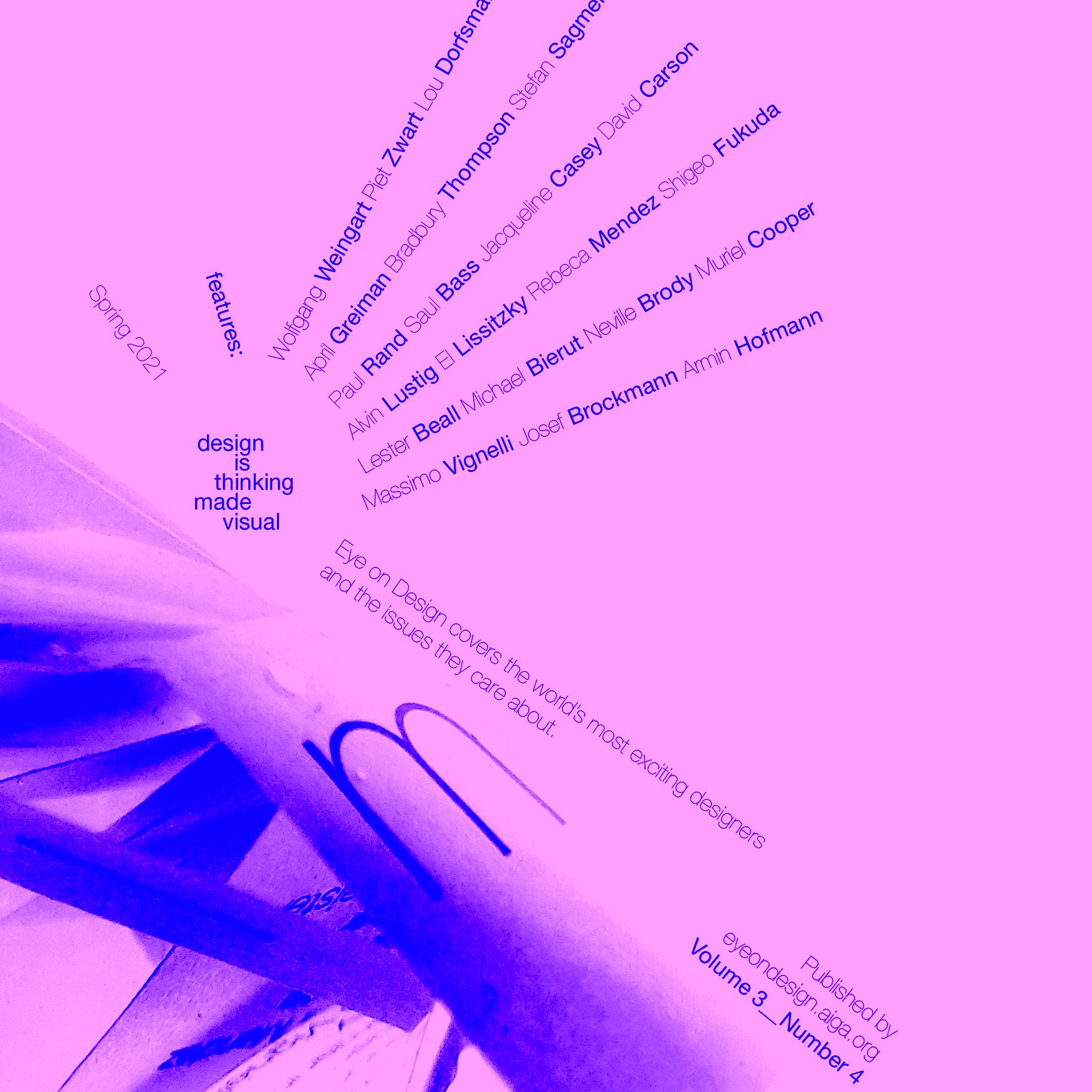
The last assignment consisted of using every thing I’ve learned until now and add colors plus images as well. Being able to play with colors was a great way to elevate the designs by reinforcing some principles such as contrast on the page or improving the focal point.